Research News
02/22/2018
Why Unrelated Diseases Follow the Same Incubation Pattern: Lessons from Evolutionary Dynamics, Statistics

When graphed, the incubation periods of many diseases, ranging from polio to measles to leukemia, have the same shape; they are skewed to the right. This means that when incubation periods, or time from pathogen exposure to symptomatic illness, and number of new disease cases in a population are plotted on the x- and y-axes, respectively, the peak of the curve falls on the left side of the graph, with a long tail on the right.
Why do so many unrelated conditions follow this same predictable pattern? Researchers have long accepted that the heterogeneity of the host, pathogen or dose is behind the ubiquity. Conventional wisdom says that if these things were homogeneous, incubation periods would be identical for every disease. Collaborative research out of Cornell University and Cleveland Clinic, published in eLife, offers a new explanation for this phenomenon, which allows for, but does not rely on, heterogeneity.
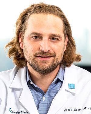
Jacob Scott, MD, Cleveland Clinic Departments of Translational Hematology and Oncology Research and Radiation Oncology, and Bertrand Ottino-Loffler, PhD, and Steven Strogatz, PhD, Cornell University Center for Applied Mathematics, developed a new mathematical model, based in evolutionary graph theory, which can better predict and explain the distribution of incubation periods without requiring host or disease heterogeneity. At the heart of the model are two mechanisms of randomness well-associated with probability theory: the "coupon collector" and "random walk." How fit an invader is-that is, how likely a pathogen is to overtake a neighboring healthy cell-determines which mechanism accounts for the right-skewed distribution.
If a pathogen is very fit, the process of incubation will follow the "coupon collector" pattern. In this scenario, disease incubation is like blindly drawing marbles from a bag with replacement, where pathogenic cells are red marbles and healthy cells are blue marbles. If you start with one red marble and many blue marbles in the bag-a single pathogenic cell amongst a population of healthy cells-probability dictates that almost every early draw will be a blue marble. As you draw more and more blue marbles, and subsequently replace them with red-which represents pathogens invading and taking over healthy cells-it will take longer to randomly draw the few blue marbles that remain. This eventual slowdown in conversion from healthy to diseased cells explains why graphs of incubation periods typically peak early and have long tails on the right.
If a pathogen is only neutrally fit-meaning a pathogen has little to no selective advantage, and is as likely to outcompete a healthy cell as it is not-the process of incubation will likely follow the "random walk" pattern. Think of this scenario as a map, where introduction of the first pathogenic cell into a healthy population is "point A" and full symptom manifestation, or pathogen takeover, is "point B." There are a limited number of ways to walk from point A to point B quickly, but many possible long and roundabout ways. The probability that a pathogen will choose one path over another depends on its competitive advantage. One of these long, roundabout paths becomes more probable under neutral fitness, offering another explanation for why graphs of incubation periods follow a right-skewed distribution.
This new model may have important implications for the fields of epidemiology, evolutionary biology and cancer research because, unlike the previously accepted hypothesis, it holds true for both heterogeneous and homogeneous populations of pathogens and hosts. It is important to note, however, that this model is only hypothesized to explain the network and invasion dynamics of cancer cells and bacteria; additional research is necessary to determine whether the model applies to viruses, too.
Want To Support Ground-Breaking Research at Cleveland Clinic?
Discover how you can help Cleveland Clinic save lives and continue to lead the transformation of healthcare.
Give to Cleveland Clinic